
Introduction
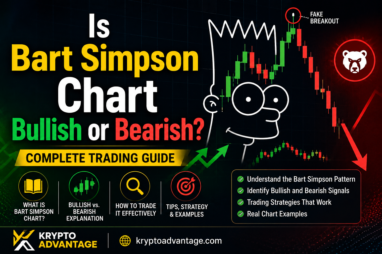
You’re staring at a crypto chart. Suddenly, the price shoots straight up, sits flat for a while, then crashes right back down. It looks like a cartoon character’s spiky hair.
If this sounds familiar, you’ve spotted a Bart Simpson chart. It’s named after Bart’s famous hairstyle from The Simpsons.
So, is the Bart Simpson chart bullish or bearish? The honest answer is: it depends. This pattern can go either way, and knowing the difference could save you from a bad trade. In this guide, we’ll break down both versions, show you how to spot them, and explain how traders actually use this pattern. If crypto price behavior like this is new to you, our crypto section has more beginner-friendly breakdowns to start with.
Disclaimer: This article is for informational purposes only and is not financial advice. Cryptocurrency prices are highly volatile — always do your own research before trading.
What Is the Bart Simpson Chart Pattern?
The Bart Simpson pattern is a short-term price formation seen mostly in crypto markets. It has three simple parts: a sharp price move, a flat pause, and then a sharp move back.
Picture three steps. First, a sudden spike, up or down. Second, a flat, sideways stretch where the price barely moves. Third, a fast reversal back to where it started.
Put those three parts together, and the chart looks like a spiky head with a flat top. That’s why traders started calling it the Bart Simpson trading pattern.
Why Traders Call It “Bart Simpson”
The name isn’t official finance jargon. It grew out of crypto trading communities online, not textbooks. Traders noticed the shape kept repeating and gave it a name everyone could picture instantly. Unlike formally studied formations such as the head and shoulders pattern, the Bart Simpson pattern has no textbook definition — it’s purely trader slang that caught on because the shape is so recognizable.
The pattern became especially well known during quiet, low-volume periods in the crypto market. Thin, sleepy markets make this kind of sudden, reversible price move much more common.
Where You’ll See This Pattern
This pattern shows up most often in cryptocurrency markets. However, it isn’t limited to crypto alone. It can occasionally appear in forex and small-cap stocks too, especially when trading volume is thin.
You’re most likely to spot it on short timeframes, like 15-minute or 30-minute charts. It shows up far less often on daily or weekly charts, since it usually needs low liquidity to form in the first place — the same kind of thin-liquidity environment we walk through when covering how to buy smaller-cap coins safely.
Is Bart Simpson Chart Bullish or Bearish? The Real Answer
Here’s the key thing to understand: the Bart Simpson crypto pattern actually has two versions. One leans bearish. The other leans bullish. The shape looks similar, but the direction of the first move tells you which one you’re looking at.
The Bearish (Classic) Bart Pattern
This is the original version, and it’s the one most people mean when they say “Bart Simpson chart.”
Here’s how it plays out. The price first shoots up sharply, almost straight up. Then it moves sideways in a narrow range for a while. Finally, it falls back down to where it started.
Think of it like a firework. It shoots up fast, hangs in the air for a moment, then falls back to the ground. Traders who bought during the spike, hoping for more upside, often get caught off guard when the price drops back down.
These spikes often happen without any clear news or fundamental reason. That’s part of what makes this pattern so tricky. There’s rarely an obvious cause you can point to.
The Bullish (Inverse) Bart Pattern
The bullish version is basically the classic pattern flipped upside down.
It happens when the price first drops sharply, then consolidates in a flat range, and then jumps back up just as fast. In simple terms: crash first, sit flat, then recover.
This setup often suggests the initial drop was driven by panic selling rather than any real bad news. The recovery afterward shows buyers stepping back in, which can point toward a bullish move ahead.
So, when someone asks “is Bart Simpson pattern bullish or bearish,” the real answer is: check which direction the first spike moved. Down-then-up leans bullish. Up-then-down leans bearish.
How to Identify a Bart Simpson Pattern on a Chart
Spotting this pattern takes a little practice. Here’s what to look for, step by step.
Step 1: Look for the Sharp Spike
Watch for a fast, almost straight-line move in price. This can happen in minutes, especially on lower timeframes. Volume during this spike is often high, but it isn’t always backed by real, sustained trading interest.
Step 2: Watch the Flat Consolidation
After the spike, price should move sideways in a tight range. Trading volume often drops noticeably during this phase, showing a lack of strong interest from either buyers or sellers.
This flat stretch forms the “hair” part of the pattern. It can last anywhere from a few candles to a few hours, depending on which timeframe you’re watching.
Step 3: Confirm the Reversal
The pattern only completes once price makes a sharp move back toward its starting point, almost mirroring the first move. This is the confirmation step. Until this reversal actually happens, you’re only looking at half a pattern, not a full one.
Why Does the Bart Simpson Pattern Happen?
There are a couple of theories behind this pattern, and they’re not mutually exclusive.
Low Liquidity and Thin Order Books
Many traders link this pattern to low liquidity conditions. When there aren’t many buyers and sellers active in the market, it takes far less money to move the price sharply in either direction.
Possible Market Manipulation
One theory points to deliberate manipulation. A large trader can push price into a zone packed with stop-loss orders, triggering a cascade of forced selling or buying, then let the price fall back once those positions are wiped out. This mirrors the mechanics of a classic pump-and-dump scheme, which the SEC notes tends to target thinly traded assets precisely because it takes less capital to move the price.
In most real cases, both low liquidity and manipulation are probably at work together. It’s rarely just one single cause.
Failed Momentum
Another way to look at it: someone tried to start a rally or a sell-off, but it simply didn’t catch on. The move fails to attract enough follow-through interest, so it fades away just as fast as it appeared.
How Traders Use the Bart Simpson Pattern
Knowing the pattern exists is one thing. Trading it well is another.
Wait for Confirmation Before Entering
Don’t jump in the moment you see a sharp spike. Experienced traders usually watch the flat, sideways phase closely and wait for a confirmed breakout before entering a position. Acting too early on just the first spike is one of the most common mistakes beginners make.
Use Risk Management
This pattern moves fast, in both directions. A tight stop-loss order is essential, since a false signal can reverse your position quickly and eat into your account. Never risk more than you’re comfortable losing on a single trade, especially on fast, short-timeframe setups like this one.
Treat It as a Clue, Not a Guarantee
This pattern works best as a warning sign, not a guaranteed setup. It tells you something unusual is happening in the market, but it doesn’t promise a specific outcome every single time.
Combine With Other Tools
Don’t trade the Bart Simpson pattern in isolation. Pair it with volume analysis, support and resistance levels, or other indicators you already trust and understand well. The same logic applies when reading any sharp crypto price swing — as we found when breaking down what actually moves SHIB’s price, a single chart event rarely tells the whole story on its own.
My Experience Spotting This Pattern
I’ve spent time watching low-cap crypto charts specifically to catch Bart Simpson formations as they happened, rather than just studying them after the fact. The pattern that stood out most to me: the classic bearish version almost always showed up on coins with unusually thin 24-hour volume, right before the spike. When I cross-checked the order book depth on a few of these moves, it rarely took more than a modest-sized order to trigger the initial spike — which lines up with why thin liquidity gets blamed so often.
The mistake I made early on was treating the flat consolidation phase as “safe” and buying into it, assuming the price would keep climbing. In several cases it didn’t — the reversal came fast and wiped out the gains I thought I’d locked in. That’s the part textbooks don’t emphasize enough: the flat middle section isn’t a pause before more upside, it’s often just the market deciding which way to snap back.
Risks and Limitations to Know
This pattern isn’t a traditional, well-studied technical formation like a head and shoulders or a double top. It grew out of trader slang, not formal chart theory, so there’s less research backing how reliable it truly is.
That matters because two charts that look like a Bart Simpson pattern can behave very differently afterward. There’s no strict rulebook guaranteeing how the price will move next.
Also, because thin liquidity plays such a big role, this pattern tends to show up more in smaller-cap coins and less-traded pairs. Those markets carry extra risk on their own, on top of whatever the pattern itself suggests.
Finally, remember that crypto markets change quickly. Trading behavior, liquidity levels, and volatility from a few years ago may not match today’s conditions. Always check current market conditions before acting on any pattern you spot.
FAQ: Bart Simpson Chart Pattern
Is the Bart Simpson pattern bullish or bearish? It can be either. The classic Bart Simpson pattern, where price spikes up, flattens, then drops back down, is bearish. The inverse version, where price drops, flattens, then spikes back up, is bullish.
Where does the Bart Simpson pattern usually appear? It shows up most often in cryptocurrency markets, especially on short timeframes like 15-minute or 30-minute charts. It can occasionally appear in forex and small-cap stocks too.
Is the Bart Simpson pattern a sign of market manipulation? It can be, but not always. Thin trading volume alone can create a similar price shape, so treat this pattern as a reason to dig deeper, not as proof of manipulation on its own.
How do I trade the Bart Simpson crypto pattern safely? Wait for the sideways consolidation phase to finish and confirm a clear breakout direction before entering. Always use a stop-loss, since this pattern can move fast in either direction without warning.
Is the Bart Simpson pattern reliable? It’s a useful pattern to recognize, but it isn’t a guaranteed signal on its own. Combine it with volume analysis and other technical tools rather than trading it in isolation.
Conclusion
So, is the Bart Simpson chart bullish or bearish? It genuinely depends on which version you’re looking at. The classic pattern, spike up, flatten, fall, leans bearish. The inverse pattern, drop, flatten, rally, leans bullish.
The shape looks simple once you know what to look for: a sharp move, a flat pause, then a reversal back. However, don’t trade it blindly. Wait for confirmation, manage your risk carefully, and use it alongside other tools you already trust.
Next time you spot a chart that looks a little too much like Bart Simpson’s hair, you’ll know exactly what it might mean, and how to handle it with confidence. For more chart patterns and crypto trading breakdowns like this one, browse our full crypto section.